Color Pairing 101: Effortless Combinations That Always Work
Build outfits fast with timeless color pairings, contrast rules, and capsule palettes that flatter every skin tone and style—no guesswork.
The Neutral Base That Never Fails
Building outfits around neutrals is the simplest way to guarantee color harmony. Think black, white, navy, charcoal, beige, cream, and soft stone tones as your reliable anchors. These hues play nicely with almost any shade because their undertones are subtle and versatile. Pay attention to temperature when choosing a base: cream and camel lean warm, while cool gray and crisp white read cooler. Elevate a neutral look through texture and finish. A matte knit, a buttery leather bag, a satin blouse, and structured suiting create visual dimension without competing colors. Aim for a dominant base with a supporting hue and an accent for energy. A white shirt with navy trousers and a tan belt feels timeless; add gold jewelry for warmth or silver for cool clarity. A beige trench over an all-black column instantly refines proportion. With the right foundations, you can layer bolder shades later and still keep the outfit cohesive and effortless.
Monochrome, Reimagined
A monochrome palette shows sophistication when you play with tints, tones, and shades of one color. Instead of matching exactly, build a gradient. Imagine deep forest, mid moss, and pale sage in one look, or charcoal, smoke, and pearl gray styled together. The key is depth through texture and contrast in materials. Pair a ribbed knit, smooth wool, polished leather, and a slight sheen for movement. Keep silhouettes varied so the outfit does not feel flat: a tailored blazer over fluid trousers, or a soft tee under a structured coat. Accessories in the same family maintain harmony, while a subtle metallic adds lift without derailing the theme. Denim on denim works the same way—mix washes and fabric weights for richness. If you try all white or all black, lean into contrast with crisp cotton, chunky knit, glossy patent, and suede. Monochrome done right reads intentional, modern, and effortlessly polished.
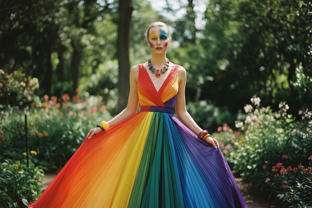
Complementary Pop for Confident Contrast
For striking balance, combine complementary colors—opposites on the color wheel that amplify each other. Classic pairs include blue with orange, red with green, and purple with yellow. The secret is controlling saturation and value. A muted terracotta works beautifully with soft teal; a vibrant cobalt sings with a gentle apricot. Introduce neutrals as buffers so the duo feels wearable: navy plus a warm tan belt, or charcoal with cream sneakers. Prints can be your shortcut. A scarf or shirt that blends both shades unifies the look, letting you echo one hue in a bag or shoe. For office settings, keep the base subdued and use the opposite hue as an accent—a belt, tie, or earrings. For casual days, expand the color proportion to a knit or jacket. When in doubt, reduce the intensity of one partner so the other becomes the hero, creating a confident yet balanced statement.
Analogous Harmony for Effortless Flow
Analogous pairings—neighbors on the color wheel—create smooth, fuss-free cohesion. Picture blue drifting into teal and green, or rose blending into coral and peach. Because these colors share DNA, they layer beautifully without clashing. Start with a deeper anchor (navy, bottle green, or cranberry), add a mid tone for body, and finish with a lighter highlight near the face to brighten. Think a teal blazer, sea-glass blouse, and soft mint trouser, grounded by a neutral shoe. Enhance the effect with texture and subtle pattern—an ombre scarf, a marled knit, or a tone-on-tone stripe. Metallics act as quiet neutrals here; brushed gold warms a coral-to-rose story, while cool silver sharpens blue-to-green blends. If your complexion favors warmth, shift the trio warmer (olive, moss, lime). Prefer cool clarity? Slide toward icy blue and jade. The result feels thoughtfully layered, graceful in motion, and remarkably easy to mix and match.
Mastering Undertones and Temperature
Great color pairing relies on undertones and temperature. Clothing, like complexions, reads warm, cool, or neutral. Warm hues have golden or earthy bases (camel, rust, olive), while cool hues lean blue or rosy (charcoal, fuchsia, cobalt). For the most flattering harmony, align your outfit's temperature with your skin's. If gold jewelry lights you up, warm-leaning palettes tend to flatter; if silver shines brightest, cool-leaning palettes may be ideal. You can also mix temperatures purposefully: pair a cool navy suit with a warm caramel belt, then bridge them with a neutral ivory shirt. Watch lighting too; daylight makes colors feel truer, whereas indoor lighting can warm or dull them, shifting how combinations appear. Reflective fabrics amplify saturation, while matte textures soften it. When experimenting, position the friendliest tone near your face and push riskier shades to shoes or bags. Thoughtful attention to undertones makes every pairing look intentional and polished.
Build a Color Capsule That Works Year-Round
A strategic color capsule streamlines dressing and multiplies outfits. Choose a few reliable neutrals as your base (navy, charcoal, beige), two harmonizing colors you love, and one or two accent shades for energy. Keep saturation levels similar so pieces mix seamlessly. Anchor your closet with essentials—tailored trousers, crisp shirts, knits, and a versatile jacket—in your base hues. Add interest with a printed piece that includes your palette; it becomes a roadmap for pairing. Rotate accents by season or mood: saffron or coral when you want warmth, icy blue or violet when you prefer cool freshness. Accessories are the easiest way to test new colors without overwhelming the look—think scarves, belts, bags, and sneakers. For travel, pack within your capsule to ensure every item works with the others. With a cohesive palette and thoughtful layering, you will assemble outfits faster, reduce decision fatigue, and look consistently put-together with minimal effort.